4 min to read
Becoming MacGyver using the CSS Swiss Army Knife in Sitecore SXA

 Using CSS in the old days
One of the things I started to dislike when working on a project is Bootstrap. Using Bootstrap in a simple site is fine as you can easily use it as a starter and throughout the years it has been very well documented and supported. But it also comes with an extensive list of components and base styling for most HTML elements. And this is where advanced design projects will expect advantages when using Bootstrap as it will style your components and even the ones that you do not want to be styled. So can be Bootstrap be your grid system? Bootstrap is nice for terraced houses but not when you're building a nice villa :-p

 CSS in the new World
Every site needs a good, nestable grid system.
Sntxrrr's grid system is based on Nicole Sullivans OOCSS principles but
uses flexbox to line up columns/cells/units. Flexbox is the holy grail of layouting :-)
Want to skip to the conclusion or get the code?
I've been working on several projects with my colleague Sntxrrr and his only reaction when it comes to Boostrap:

So what to use instead? His own grid system! Sntxrrr built a system from scratch and we use it in many of our projects. It's very lightweight and I'll be sharing this with you. The repo can be found on github:
Gary.Sitecore.Sntxrrr.
 Becoming MacGyver using the CSS Swiss Army Knife in Sitecore SXA
The actual scaffolding of the grid in SXA depends on a few items:
- Definition - a list of devices and our 12-column grid and class names. It also holds reference to the css file in the Media Library and the grid view (cshtml)
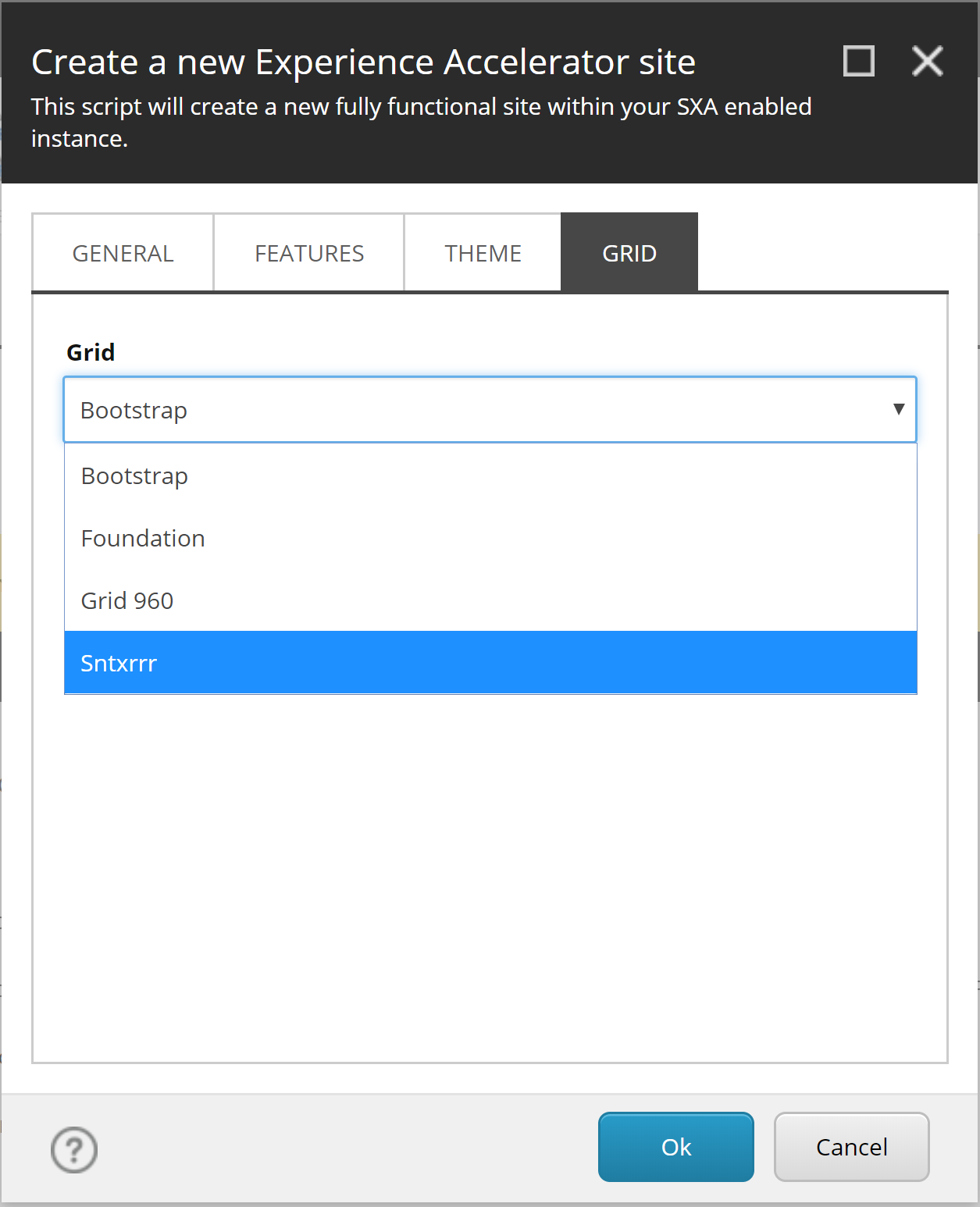
- Setup configuration - used by SXA to identify our grid which points to the grid definition
- CSS - the actual grid css file (in my demo it is not minified so make sure to do that when using it in production)
- Grid view - a CSHTML file in the SxaLayout view folder with the markup for the placeholders
 Adding a grid definition
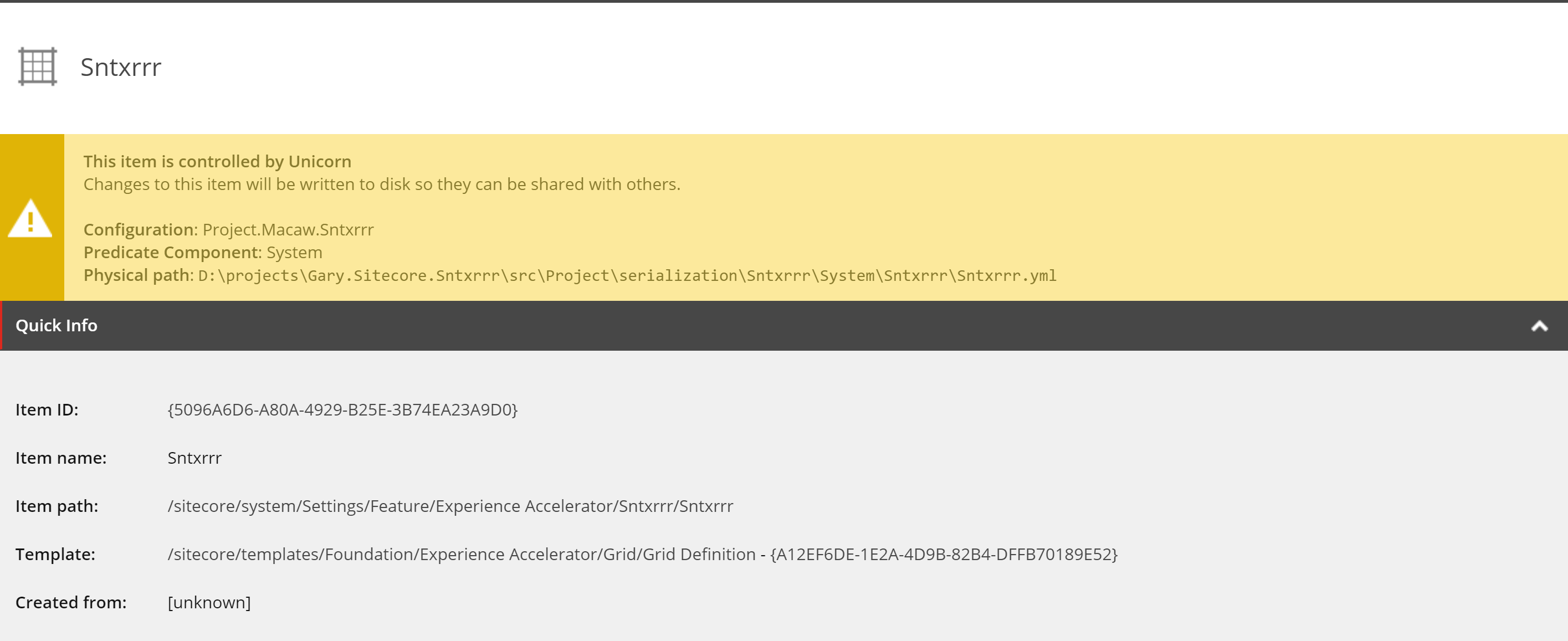
The first thing we have to do is creating a grid definition that wil be derived from:
/sitecore/system/Settings/Feature/Experience Accelerator/Sntxrrr/Sntxrrr

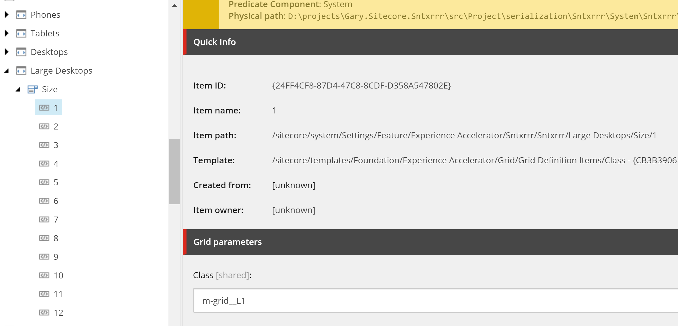
Now we have the definition in place we can add the devices supported by the grid. Most grid systems like Bootstrap handle the most common devices with classnames like m for medium, s for small and xs for extra small. Sntxrrr's grid uses a responsive grid-view with 12 columns, to have more control over the web page. It provides classes for the following devices:
- Phones - m-grid__
- Tablets - m-grid__S
- Desktops - m-grid__M
- Large Desktops - m-grid__L
As an example this will look like the picture below. Notice that the classnames will also hold the number of the column.

 Adding the grid setup template
We also have to add a setup definition for our grid system. When we are creating a new site we want to select our Sntxrrr grid. This is done by adding a Grid Setup. In the same folder as the definition we add a new item from template and choose (please don't do this by hand but just sync with my unicorn items, you'll get Sntxrrrr for free ;-) ):
/sitecore/templates/Foundation/Experience Accelerator/Scaffolding/Roots/Grid Setup
I could use a screenshot of that but there's no neccessity as the only field there is the location of the grid definition (and am lazy so no pic here!).
 Adding the CSS
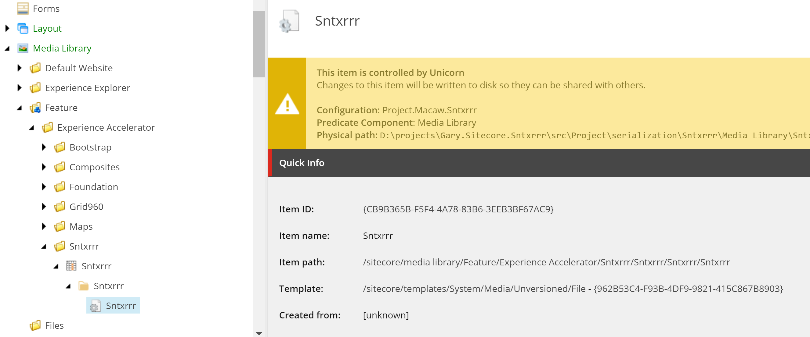
The CSS file will be added to the Media Library. For this to work with SXA we have to add a grid theme based on the template:
/sitecore/templates/Foundation/Experience Accelerator/Grid/Grid Theme
Add a Styles folder under that one and then upload your CSS file. Make sure your definition points to that file.

 The view and Unicorn Sync
The view is a copy from the Bootstrap view and has altered class names. This is also added to my git repo. Just publish the solution and you have it in place.
After the publish we can spin up the site and sync the items with Unicorn (check your config) or do it from the url.

Now you can create a new site with your own grid system!

 Conclusion
It's not mandatory to use one of the default grid systems which come out of the box with SXA. It is actually pretty simple to create and use your own grid system in SXA. I think it is very cool that even the out of the box SXA components work with your own grid system making it a very kickass feature!
 Sitecore SXA is cool!


Comments